Table of Contents
Table of Contents
Mid-century graphic design was a creative tug-of-war between structure and spontaneity; a race to rebuild, redefine, and reconnect after two devastating World Wars. In the Western world, this was a time where optimism danced with uncertainty, clean grids met playful rebellion, and new visions of globalism took center stage.
The 1940s: Austerity and Unity
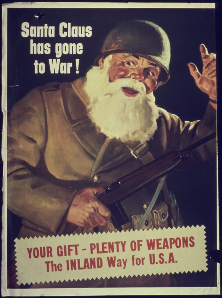
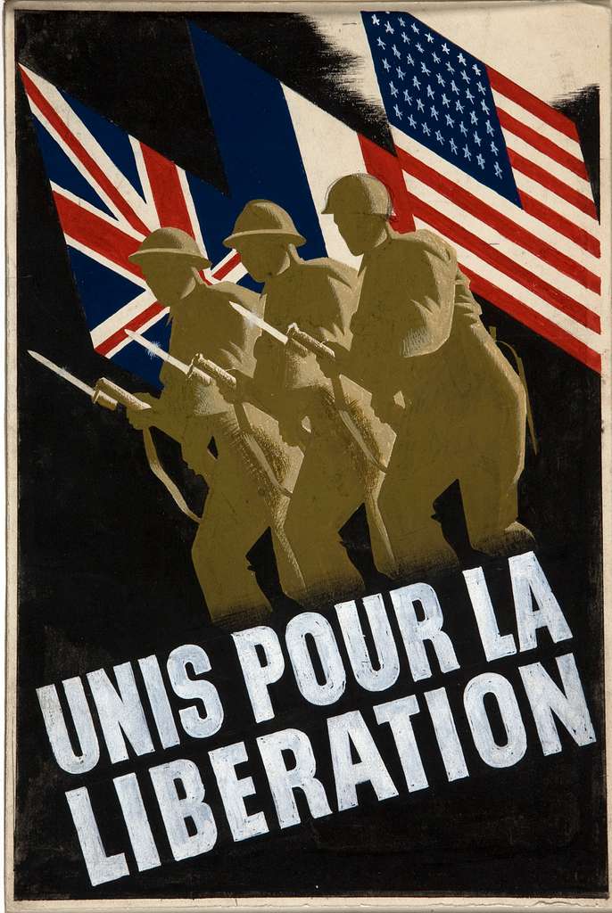
The visual language of the 1940s offered a sense of warmth and personality. Magazine advertisements, packaging, and book covers often featured hand-drawn illustrations with rich detail, ornate typography, and a decorative sensibility. And yet, World War II was a dominating force in everyday life.
With paper shortages and limited color printing, resources were scarce, which also led to a focus on function over form. Art and design often served national agendas: patriotic posters and wartime propaganda promoted national unity. Even commercial illustration could carry a sense of duty and restraint.

After 1945, there was a hunger for stability, but also progress. Post-war reconstruction began, while nations in Asia, Africa, and the Caribbean were gaining independence after years of colonization. The world needed new systems: new nations, new organizations, new ways of communicating and exchanging across borders.
The 1950s-1960s: Prosperity and Globalism
Earlier cultural exchange was often slow and elite, filtering through museums or wealthy patrons. The mid-20th century saw air travel, television, and technical advances in print reproduction, allowing ideas to spread faster than ever before… while mass media and consumer capitalism made design innovation a popular, everyday experience.
Advances in offset lithography, phototypesetting, and color printing allowed for vibrant, detailed, and widely distributed work. Building on pre-war modernism and interwar artistic movements, the 1950s exploded with bold, optimistic, and experimental design trends. The 1960s took these concepts to the max: more experimentation, more abstraction, and the seeds of a new counterculture.
The Western aesthetic of the 1950s–1960s was defined by bright colors and playful abstraction; a mix of modernist minimalism and exuberant Pop Art. Over a backdrop of technological optimism and global ambition, a sort of synergy emerged, permeating the seemingly disparate worlds of corporate logos, children’s books, and mass-market advertising. This tension between order and play was foundational in creating mid-century graphic design’s legacy and influence today.
A closer look at how order & play defined mid-century graphic design
The postwar world demanded order: grids, systems, and universal visual languages that could rebuild institutions, launch global brands, and project ideological confidence. But it equally demanded play: color, warmth, and whimsy that could sell suburban dreams, captivate children, and eventually fuel countercultural rebellion. The era’s most enduring work lived in the creative tension between these two impulses.
Cool design in the Cold War
During the Cold War, government exhibitions, World’s Fairs, and international organizations like the UN adopted modernist design to project rationality, unity, and progress. Switzerland became the birthplace of the International Typographic Style, a visual language built for global legibility. Designers like Armin Hofmann and Josef Müller-Brockmann championed grids, sans-serif typefaces, and clean hierarchies that could communicate across languages and ideologies.
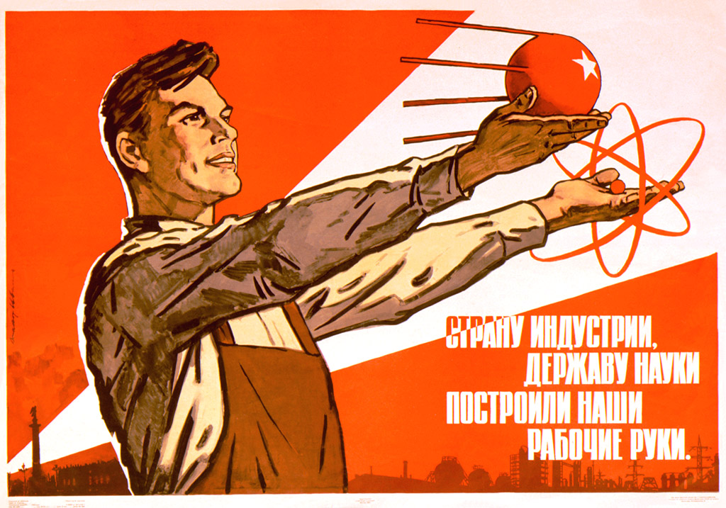
Universal clarity became both an aesthetic ideal and political necessity. The U.S. and USSR each projected competing visions of modernity through visual culture: one emphasizing consumerism and individualism, the other emphasizing collective cooperation and industrial might, both using bright colors, clean lines and contrast to create an expressive emphasis progress.
Clean corporate aesthetics
The corporate world answered the same call for order, and logos became flags for multinational capitalism. Companies going global needed visual systems that were simple, reproducible, and recognizable anywhere. In the U.S., Paul Rand transformed logos from trademarks into comprehensive brand identities, blending artistic expression with commercial utility. In Britain, Abram Games designed posters for the War Office and later corporate clients that balanced bold geometric forms with wit and visual surprise.
Postwar picture books
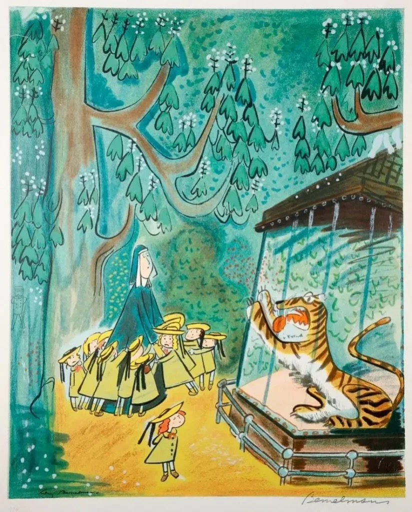
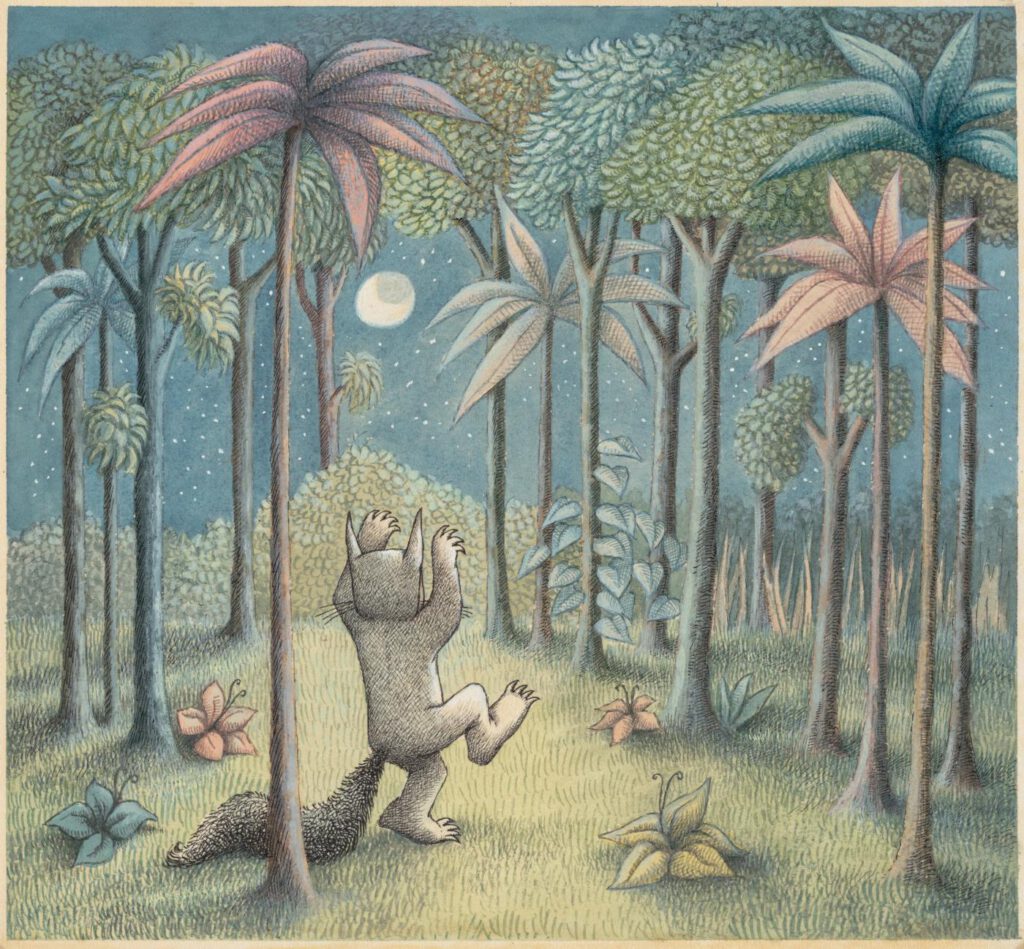
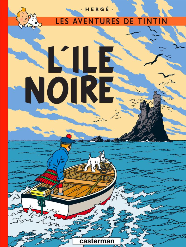
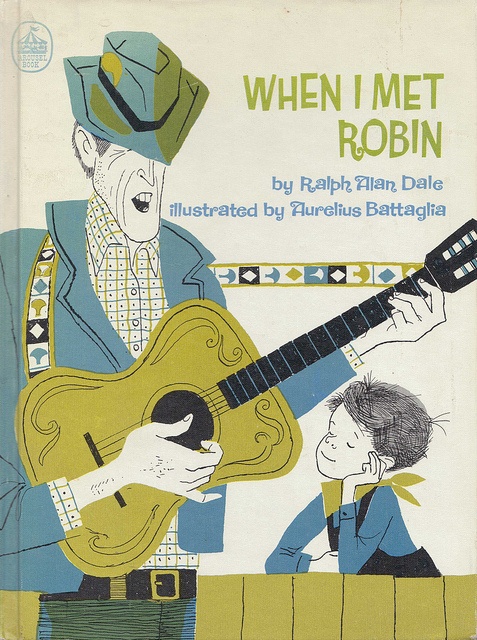
Children’s book illustration offered perhaps the purest expression of order and play in balance. The postwar baby boom created a massive audience for picture books, and illustrators rose to the challenge with work that was both meticulously composed and emotionally resonant. Ludwig Bemelmans’ Madeline spreads were loose and painterly, yet carefully structured, winning the Caldecott Medal in 1954. Maurice Sendak’s Where the Wild Things Are paired wild, emotional illustration with precise page design. Across the Atlantic, Hergé’s Tintin series used the ligne claire (clear line) style: precise draftsmanship in service of adventurous, imaginative storytelling.
Creativity in consumer culture
In a way, consumer culture democratized design by making it an everyday experience rather than reserved for the art elite. Saul Bass’s posters for Vertigo, North by Northwest, and Psycho used structured grids as stages for kinetic typography, bold color, and abstract forms that pulsed with energy and narrative tension.
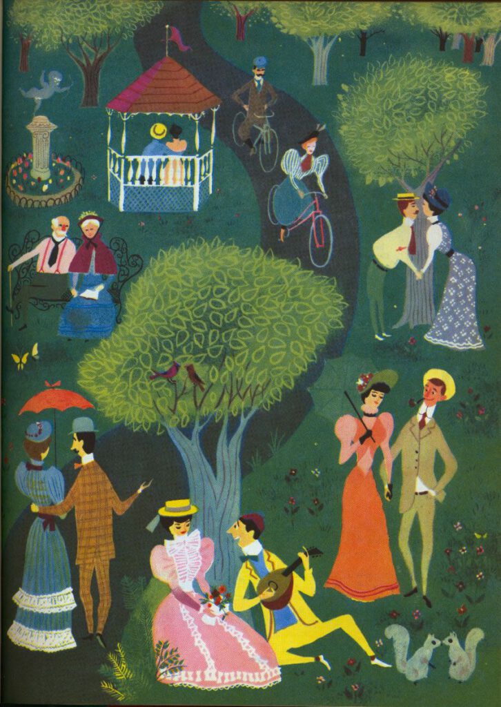
Meanwhile, illustrators like Aurelius Battaglia, whose work decorated everything from Disney storybooks to mid-century advertisements, paired precise compositional structure with loose, gestural linework and warm, spontaneous color. His illustrations were meticulously designed and yet felt hand-drawn, orderly and yet alive.
Pop Art, originating in the 1950s, celebrated the objects of daily life with irony and affection. Famous within this genre, Andy Warhol elevated soup cans into museum art, Roy Lichtenstein turned comic strips into monumental paintings.
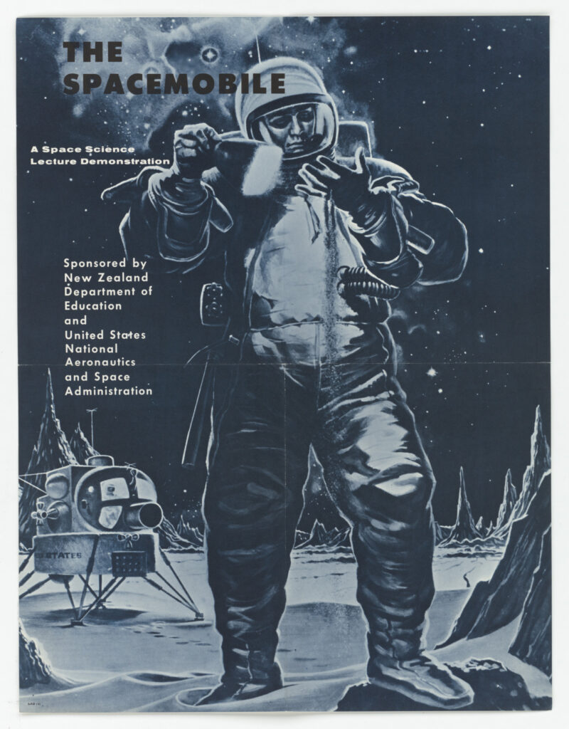
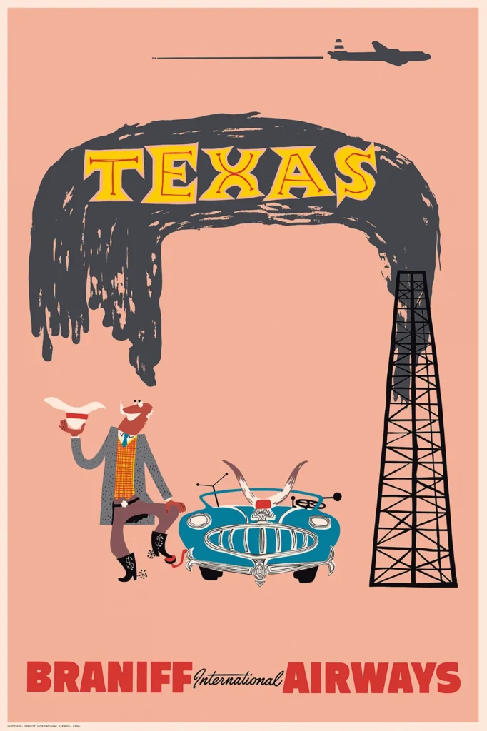
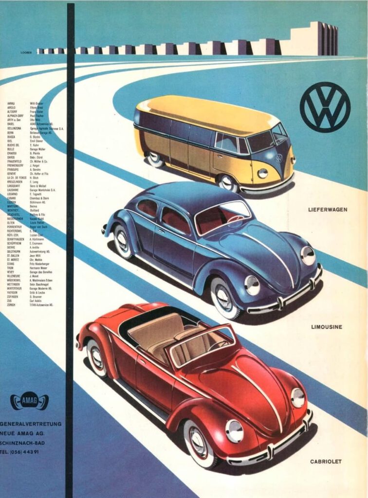
Sputnik and the moon landing fueled fascination with technology, and advertisements responded with sleek geometries, metallic palettes, and dynamic forms. Travel posters for airlines like Pan Am and Braniff International used bold, minimalist layouts with starbursts and boomerang motifs to sell the thrill of jet-age travel. Car advertisements, from the Ford Mustang to the Volkswagen Beetle, paired clean typography with dynamic photography, selling visions of freedom and modernity. Appliance companies promised a bright yet orderly home, with illustrations of sleek, metallic products in fun, futuristic kitchens.
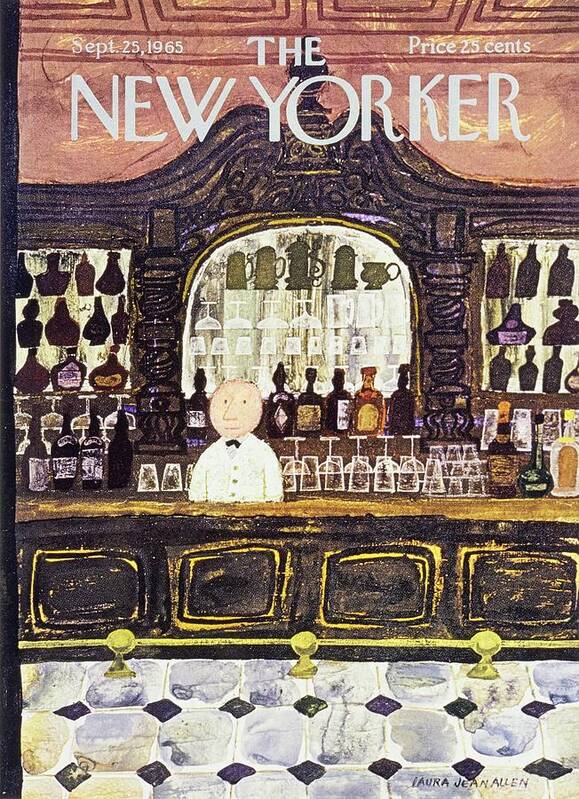
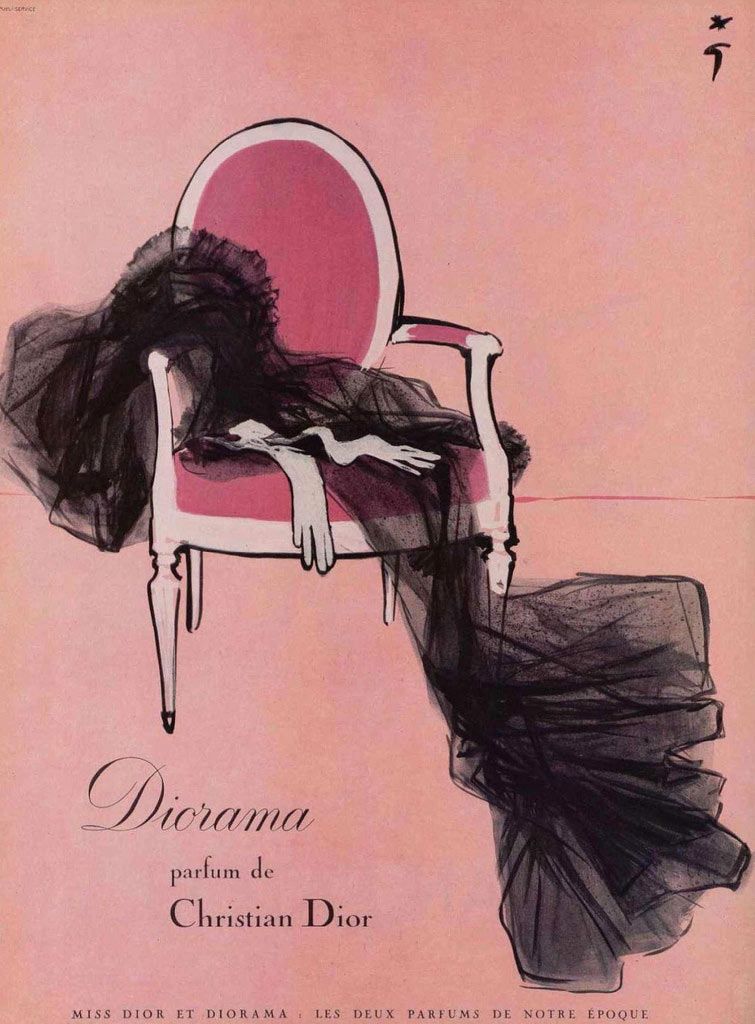
Lifestyle and fashion illustration, too, found a playful, sensual register. Laura Jean Allen’s magazine illustrations blended polished line work with expressive, stylized figures, while René Gruau’s perfume advertisements for Dior used bold, gestural lines and flat color fields that were minimalist but lush in atmosphere.
Yet as this creative energy flourished, the idealized globalism that surrounded it carried hidden costs.
The Shadow of Global Idealism
By the late 1960s, “play” increasingly challenged “order” as the counterculture came into full bloom. In many ways, the West’s idealized globalism did more to flatten the world than to integrate it. While patterns from African textiles, Indian prints, and Japanese minimalism were absorbed into mid-century graphic design, textiles, and interiors, there could be a certain superficiality about this embrace. Some decolonizing nations adopted Western design to project “modernity,” though at the expense of their own visual traditions: the local flavor of “exotic” motifs (palm tikis, African patterns) was used more as an aesthetic garnish rather than real substance.
Meanwhile, in Europe and North America, minorities’ rights and roles were certainly expanding and shaping the design of the time, many subcultures (urban, rural, ethnic) were largely invisible in the mainstream as it still projected a homogenized (usually white, male-centered) “ideal.” The optimism of the 1950s-60s was also deeply intertwined with consumerism, and masked currents of social inequalities and Cold War anxieties. As the world continued to turn, the cracks in the facade grew. The 1960s counterculture began questioning the establishment, including the design world.
The 1970s: Backlash and Fragmentation
By the 1970s, the promise of universal progress had become irreversibly fractured across the Western world. Economic stagflation, political disillusionment, and shifting global power structures eroded trust in the institutions that had defined the postwar era, and design trends reflected this crisis of confidence.
The cool, rational, supposedly universal visual language of the 1950s–1960s became a symbol of the establishment that a new generation rejected. Optimism was replaced with skepticism, and the homogenized “ideal” became subject to backlash and fragmentation. In its place arose a celebration of the local, handmade, and specific. Design became a tool for rebellion, self-expression, and identity assertion.
This time, when the margins spoke, the center had to listen. The unmistakeable democratization of voices (especially for women, people of color, Indigenous communities, and regional cultures) was long overdue. Through psychedelic art, protest posters, underground comix, and hand-drawn typography, it reshaped the visual landscape, making design more representative and raw. This set the stage for the pluralistic, identity-driven design culture that would continue to expand in the decades to come.
But this necessary correction came with new complexities. By the late 1970s, a nostalgic sort of longing for clarity and coherence began to emerge. The 1980s would see a revival of bold, confident aesthetics – proof that the appetite for visual structure never truly disappears, just as the meanings we attach to it never cease to evolve either.
Order and Play Today
That’s the beautiful tension at the heart of design and art history. Systems of power will always co-opt appealing visual styles to reach their audiences. But that doesn’t mean the style itself is tainted, it means something about it works. Clean lines, bold colors, playful illustration: the tools are neutral. What matters is who’s wielding them and why.
New printing technology helped bring design concepts to the masses, but really, design has belonged to the masses all along. We can appreciate nostalgic aesthetics without endorsing the oppressive structures that have used them. There is a lot to love about mid-century graphic design, and a lot to acknowledge about the blind spots of its origin – in this awareness, we can tip our hat to the past, while creating something entirely new.
Mid-century graphic design is emblematic of the historical context that shaped it, and remains iconic and influential today, shaping trends in everything from contemporary branding to retro nostalgia. The 1950s–1960s built systems – grids, corporate identities, universal typographies – and then filled them with color, whimsy, and life. The 1970s shattered those systems in the name of authenticity and self-expression. The 1980s rebuilt with new exuberance. Each generation inherits the structures of the last, finds them either too rigid or too chaotic, and pushes forward into the new future of design and culture. And so it goes: the pendulum continues to swing between order and play.
What makes the aesthetic of the 1950s–1960s so memorable, and so frequently revisited, is how this apparently “golden” age seemed to capture order and play: where the rational grid and delightful flourish shared the same page in striking complement. That balance was imperfect, and built on exclusions that the decades after would rightly challenge. But the aspiration – to create design that is both structured and alive, both universal and unique – remains as compelling now as ever.
Reimagining mid-century graphic design in the 21st century
The nostalgic yet modern, clean yet playful flavor of mid-century graphic design translates remarkably well to 21st-century sensibilities. From letterpress posters to illustrated stationery to hand-drawn branding, the sleek shapes and warm whimsy of the 1950s–1960s are being repurposed for a new era. Printing technology continues to evolve in the digital age, making graphic innovation even more widely available, allowing a seemingly infinite amount of ideas and art to be sent between cultures and individuals en masse.
Envoie En Masse Collection
This is the spirit behind the Envoie En Masse collection. Everyday greeting cards with French phrases: casual, playful, and unique, whether you send them to one special person in your life or or several special people. The hand-drawn designs are an homage to the order and play of mid-century design, contemporized for a variety of occasions: saying thank you, sending a kiss, or telling someone they’re a real gem (or en français, une perle)!
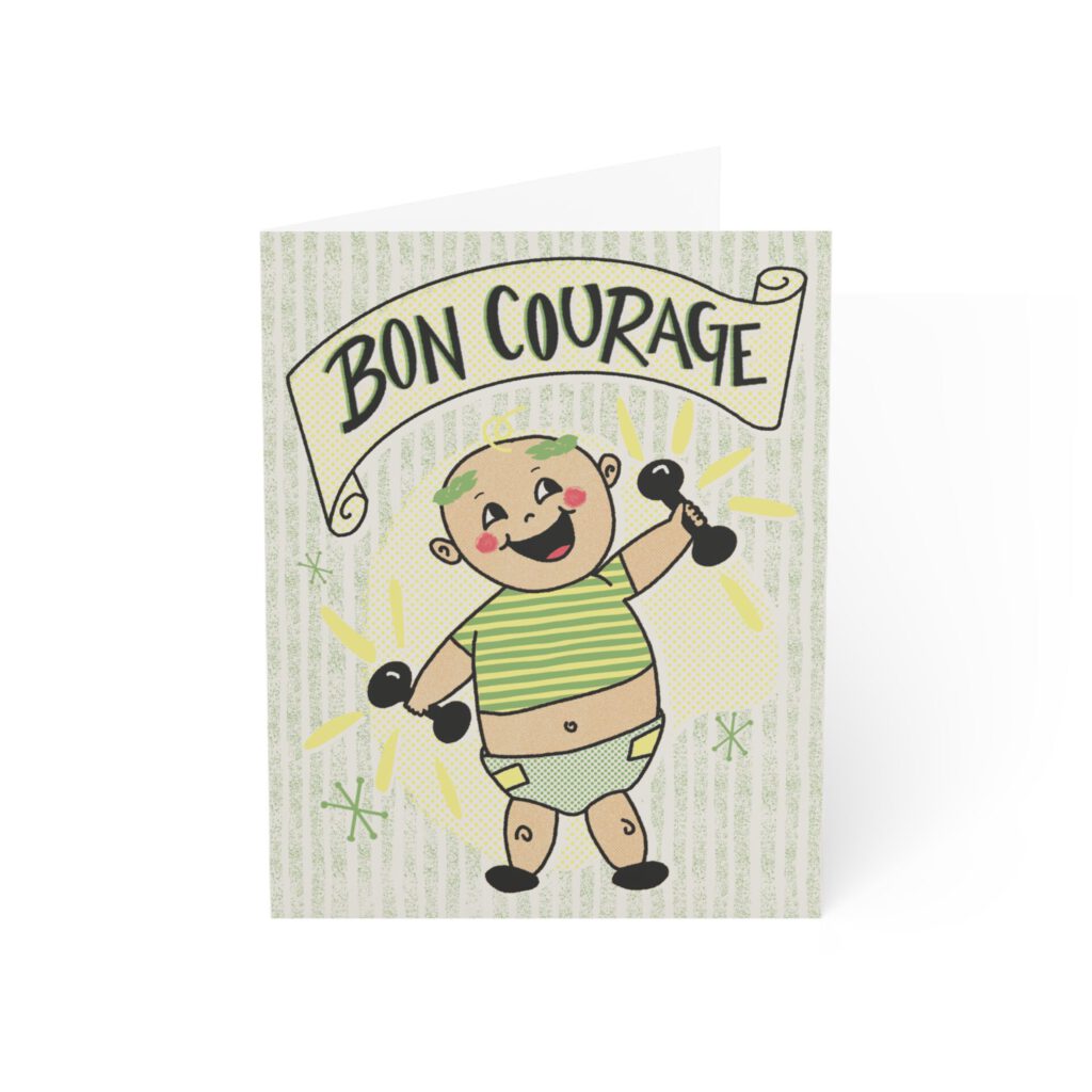
Bébé Courage
Bon courage doesn’t have an exact English translation, but it’s an extremely useful phrase. Roughly it’s like “hang in there,” or “you got this” – bon courage is a well-wish for all the strength and perseverance needed to meet whatever ends are in question.
Bébé Courage is small but mighty, flexing two tiny dumbbells, styling a Greek laurel and diaper like a champ. A brave bit of encouragement for new beginnings, big leaps, or maybe just Monday mornings.
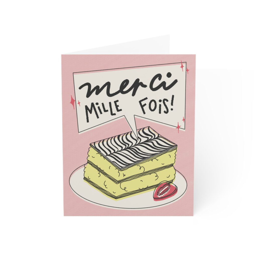
Merci Mille-Feuille
A marvelously fluffy mille-feuille pastry rests next to a strawberry, with a big bold bakery label that reads “merci mille fois !”
A thousand layers of gratitude, and no exaggerations. For someone who went above and beyond, gifting this card is a lot easier than actually saying “thanks” a thousand times.
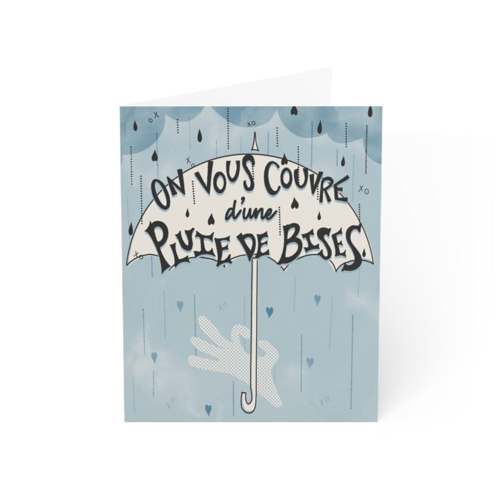
Pluie de Bises
Looks like rain – oh wait, no, it’s a downpour of LOVE! When a single “xo” doesn’t cut it, sometimes you gotta to make it rain. For anyone who needs to be doused with abundant care and affection during a transition period, hard time, or just because.
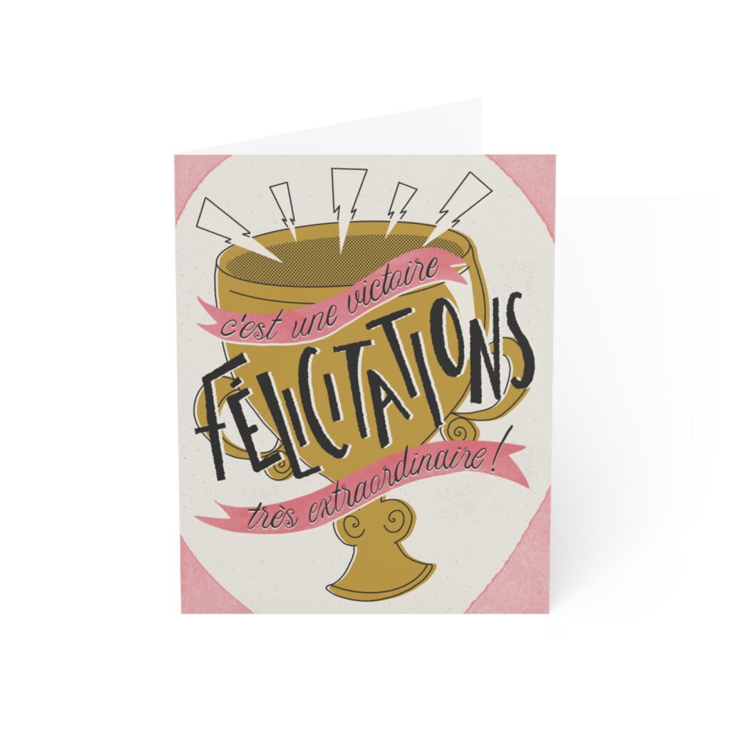
Victoire Extraordinare
When you think about it, every victory, no matter how small, is pretty extraordinary. So when every victory deserves a celebration, why discriminate?
Don’t let the good stuff slip by unnoticed. This fun and festive congratulations card, complete with ribbons and a big shiny trophy, is for any win that demands recognition: big, small, or self-declared.
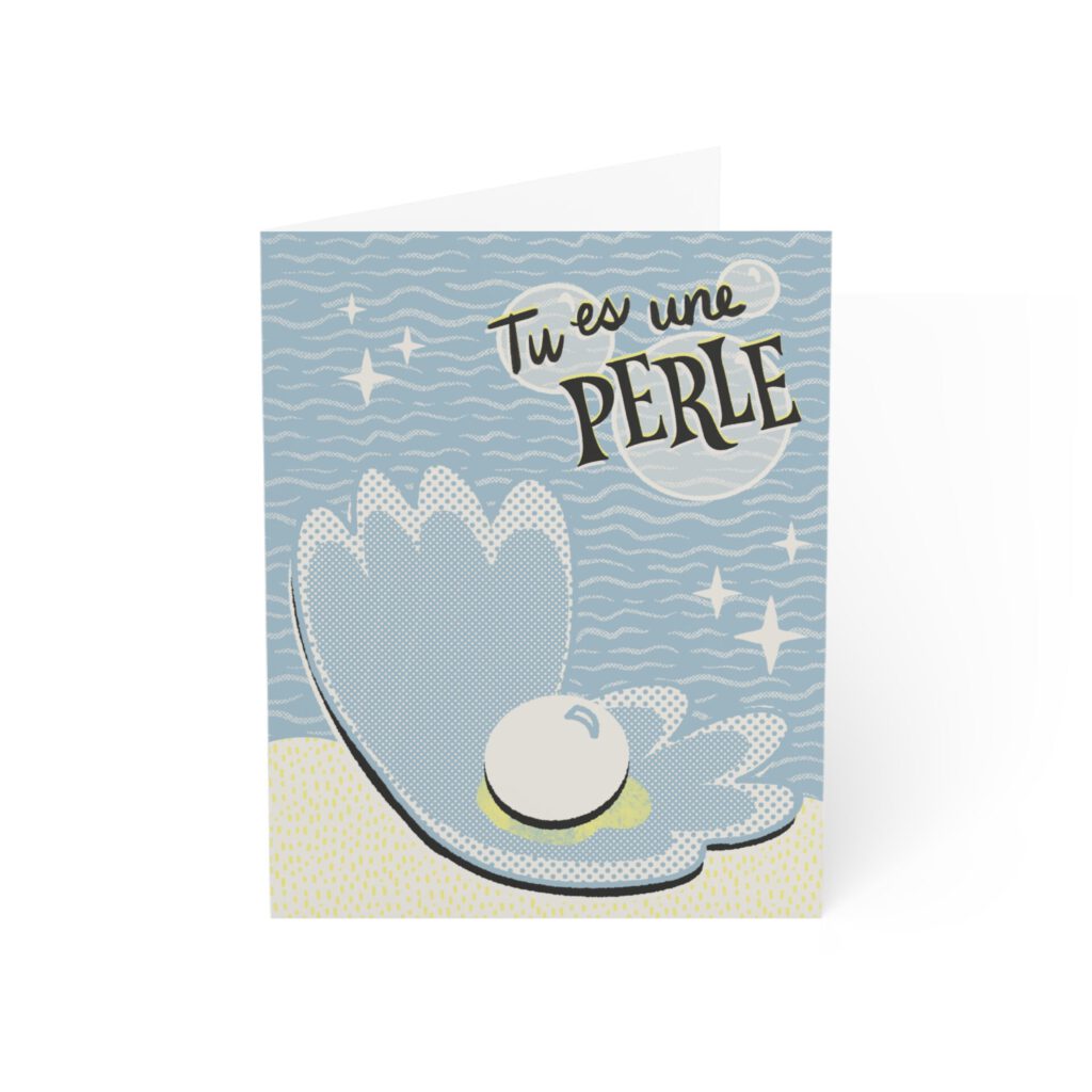
Quelle Perle
Pearls are shiny, sure, but they’re also made of grit.
This card is for someone brilliant, unique and obviously precious. It acknowledges them for being a treasure – whether it’s by saying “thank you,” “I appreciate you,” or just let to them know how truly invaluable they are.
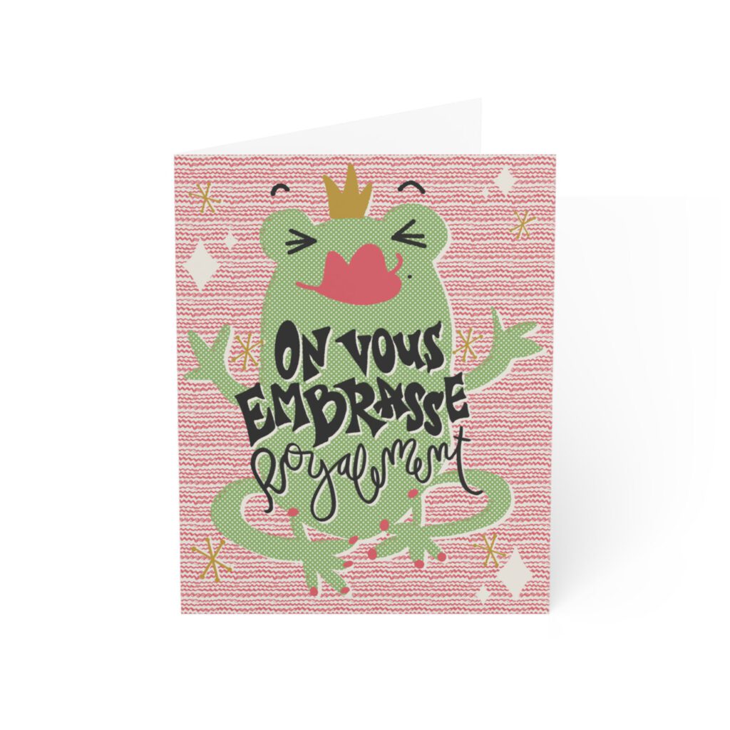
Embrasse Royale
Know how to say frog in French? Maybe, but what you might not know is it’s actually spelled gREINEouille, not grenouille. Forget the Frog Prince – because this sweet, sticky frog queen is all puckered up and royally ready to smooch. Her breath may smell like flies, but the love is real.
This card is ideal for any everyday kind of affection that goes beyond a basic embrace – deeper than pond water, yet elevated: a floating, regal address from a fancy lilypad. Perfect for friends, family, or any gigglers or goofs you just wanna squeeze.
Send One, Send All
The Envoie En Masse collection is designed for moments that matter: quiet encouragements, overflowing thanks, and affectionate gestures that say more than words alone. Each hand-drawn design pairs a French phrase with a playful mid-century inspired illustration, a little paper token of connection: congratulating a victory, showering someone with kisses, or simply telling them they’re one of a kind. Whether sent to a single recipient or distributed en masse, these cards carry the warmth of something personal, thoughtfully made, and worth keeping.